Seven Weeks In, That ERP Project Started to Slip
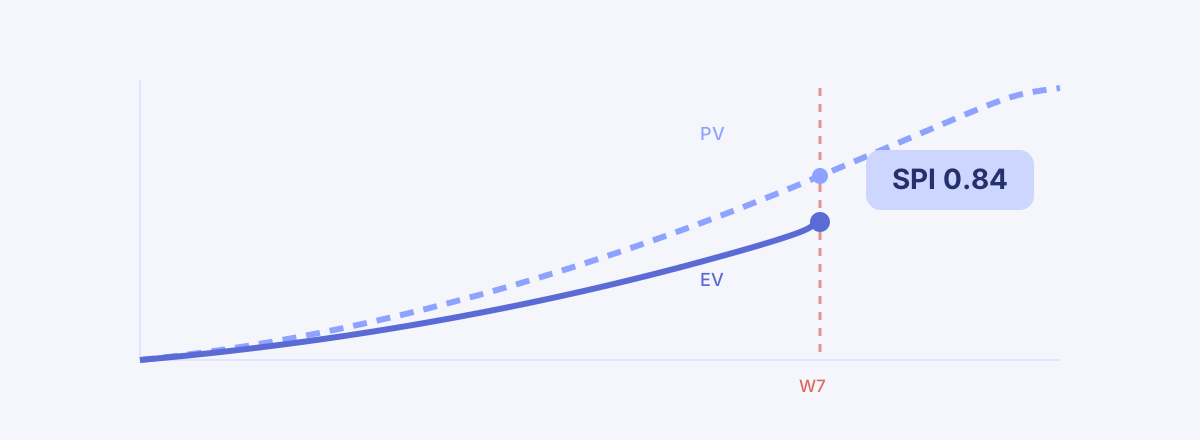
With a baseline set and progress in, SPI 0.84 raised the alarm first — an execution report tracing the slip down to the responsible work packages.
In the last case study we bolted a risk register onto that ERP project (the previous case study). Of the eight risks, the one that worried us most was poor legacy data quality — P3×I5, score 15, with a mitigation owner assigned and a deadline that had already blown past into an Overdue badge. The warning was sitting right there in the register.
Then the plan went into execution. And once execution starts, every PM question collapses into one: "Where are we, exactly? Are we on plan?" Answer that in a weekly meeting with "it feels like we're a little behind," and you cannot stop the follow-ups. How much? Where? Since when? This installment is an experiment in answering with numbers instead of feelings. As always: this is not an ad, it is a lab report. What works and what doesn't, written down as-is.
The setup — from planning to execution
The previous three installments lived in the planning phase (build the WBS, extract the reports, register the risks). This one moves into execution, which forced one change in how we run the demo. Live metrics like SPI are computed against the actual today — on a schedule that hasn't started yet, no number comes out at all. So we ran this demo on a replica of the same 44-node structure, re-anchored so that capture day lands in "execution week 7" (which is why the project code on screen reads MCG-26B), and back-filled several weeks of progress and weekly snapshot history as part of that reconstruction. That's why the dates in these screenshots differ from earlier installments. The prose sticks to week numbers instead of dates.
The stage itself is unchanged: 44 nodes — 12 summaries, 31 work packages, 1 milestone — 17 dependencies, and a final milestone called "system open."
The baseline — measuring motion requires something that doesn't move
At kickoff we did exactly one thing: established a baseline. One button creates BL-1, and a card settles at the top of Overview — Scope: 44 nodes · Schedule: 17 dependencies frozen.
Frozen is the operative word. In Part 3 we argued that your schedule didn't slip — your baseline disappeared. A project that enters execution without a baseline can slip without ever knowing it, because there is no original to compare against. BL-1 is that original. However much the plan changes from here on, BL-1 does not, and every "versus plan" is computed against this immutable snapshot.
You can build a "baseline sheet" in Excel too. The problem is that the sheet is editable. Once the schedule starts slipping, the temptation to quietly nudge the baseline and erase the variance is real — and that is exactly how baselines evaporate on most projects. Here the structure blocks the temptation: a baseline simply has no edit operation, and the active baseline is enforced to be one per project. If you want a new reference, you don't doctor the old one — you establish a new baseline, and that act leaves a record.
Week 7, 0.84 — and the curves coming apart
Execution week 7. Open the Overview and one card catches the eye first.

SPI 0.84 · SV −8%. The Schedule Performance Index is the ratio of value earned to value planned — 1.0 means on plan, below means behind. In Part 4 we walked through EVM and the lie called "80% done"; here that whole apparatus folds into a single card. As of this day the planned progress (PV) was 47% and the earned progress (EV) was 39%. Divide 39 by 47 and you get 0.84. Instead of "a little behind, I think," the answer becomes: we are moving at 84% of planned speed.
What matters is who computed that number. Nobody did. Progress entry is only allowed on leaf work packages — "accounting feature build 9%," "legacy data cleansing 12%." Summary nodes and the root roll up automatically by weight, which put the root at 39% that day, and the same weight scheme computes the plan curve that said 47%. The team typed in percentages for their own tasks; the aggregation, the weighting, and the baseline comparison were all done by the screen. The Friday-night SUMPRODUCT assembly session in Excel went to zero.
One more thing: this number lives independently of the reporting cycle. Excel-based EVM exists only on the Friday someone refreshes the sheet. This card recomputes the moment progress is entered. Delays don't wait for reporting day, and now neither does the metric.
Still, a single number can't answer "since when?" That's a job for a curve.
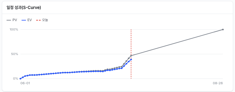
The PV (plan) and EV (actual) curves run nearly on top of each other through week 3. From week 4 they start to part, and the Friday snapshots read SPI 1.00 → 0.97 → 0.93 → 0.89 → 0.84, sliding 3–5 points a week. No single week had an accident. The project slipped a little every week — each increment small enough to hide inside a status report. What makes the S-Curve frightening is that it shows the slope: more alarming than today's 0.84 is the fact that the line has pointed one direction for four straight weeks.
Left of the red "today" line is record; right of it is plan. Past today, the PV curve climbs steeply through the stretch where the module builds overlap — meaning that at the current 84% speed, the gap widens faster than it has so far. The curve isn't a prophecy, but it does show you in which stretch the bill for procrastination will arrive.
Top Delay — the culprit was foretold in the register
After how much comes where. The Top Delay card on Overview lines up the five tasks furthest behind baseline.

First place: migration design, SPI 0.30. Fifth place: migration execution & verification, 0.30. Sandwiched between them, the accounting (0.60), purchasing (0.65), and HR (0.65) unit tests — the aftershock of receiving uncleansed data. Both ends of the list are data migration.
Note that this is not a "lowest progress first" list. Any project is full of 0% tasks — a task that is 0% because it isn't supposed to have started yet is not late. Top Delay ranks by how far each task is from where the baseline says it should be right now, weighted by its share of the plan. That's why integration testing, which hasn't started, is absent, and migration, which should be in full swing, sits on top.
The risk from last installment — legacy data quality, the one whose mitigation deadline had lapsed into Overdue — came back as a number. If the risk register is where you write "this could blow up," Top Delay is where the blow-up is proven as variance against baseline. Click a row and you land on that node in the WBS. From dashboard to the culprit's desk in one click.
Against the baseline — adjust, then overlay
Standing in front of the offending node, we adjusted. We extended the migration verification task by +3 days on the spot, and while we were in there, patched one hole in the plan — a missing dependency between integration test execution and the open (how that one change rippled through the whole schedule is a story worth its own installment, two from now).
With the adjustments done, toggle Baseline on in the Gantt, and BL-1's gray bars settle in under the current ones.
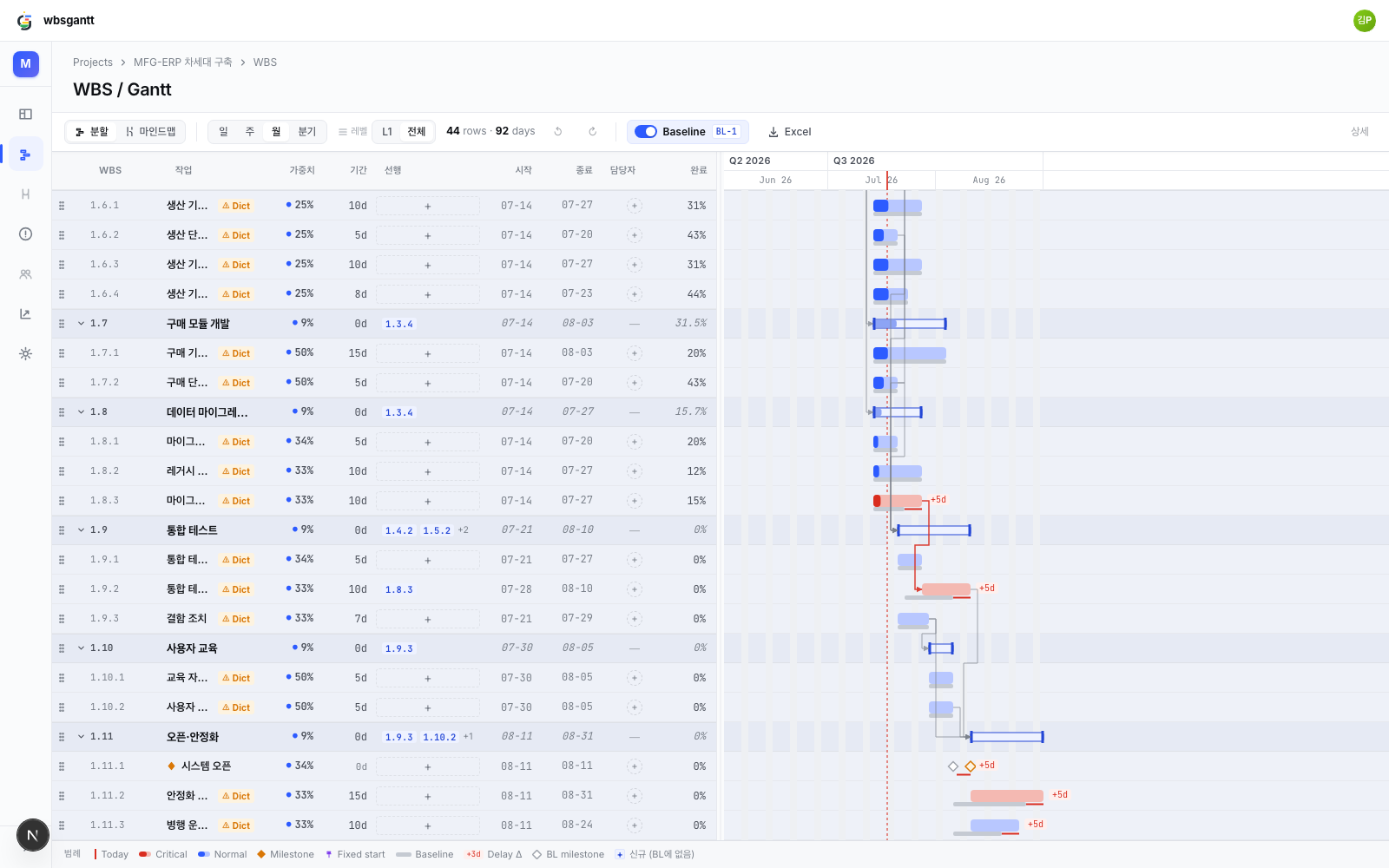
Five stretches picked up a +5d badge, and the system-open milestone shows its baseline position (hollow diamond) next to its current one (orange diamond). The baseline card on Overview updated its summary to Δ delayed 5 · added 0 · removed 0. The question "what was the original plan?" can no longer be asked in this meeting — the original plan is drawn on the same screen.
Honestly — what it doesn't do
Per this series' custom, the misses go on the record too.
- There is no cost axis. This EVM goes as far as SPI and SV. It doesn't take AC (actual cost), so CPI and EAC are out of reach. It tells you "84% of planned speed" and says nothing about money.
- EV is a weighted sum of entered progress. If the team enters generous percentages, EV is generous too. The tool does not catch the "80% done" lie for you — honest progress rules remain a human job.
- Top Delay's SV column is blunt. All five rows print SV −1 — a rounded percentage-point display — so magnitude comparison belongs to the SPI column.
- This demo's snapshot history is a reconstruction. The weeks of EV curve were seeded along with the re-anchoring (the final point matches the live computation). In real operation a daily job accumulates them.
Closing
What the baseline and SPI changed is not the size of the delay but the moment it gets discovered. Without a baseline, this project's week-7 meeting ends with "we seem a bit behind; I'll have precise numbers next week." With one, the same meeting reads: "84% of plan, four straight weeks of decline, root cause is migration, adjusted today."
Of course, 0.84 does not rescue a project. Metrics are early warning, not prescription — what to cut and who to reassign is still the PM's call. But judgment needs facts to stand on first, and what this experiment showed is that those facts — how much, since when, where — now stand up from a few progress entries and one screen.
That day, we fixed the schedule. Extended a duration, cleaned up a name, assigned an owner, corrected a progress entry that had been fat-fingered. But a week from now, when someone in the meeting asks — "when was this deadline, originally?" — what will we answer with? That answer is the next installment.
Read next
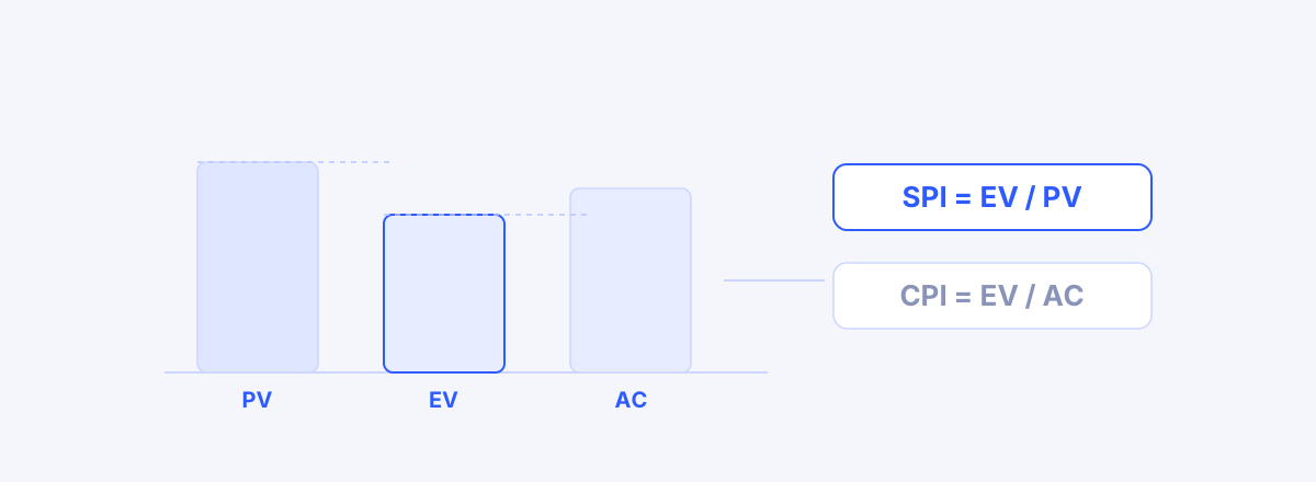 How to Calculate SPI and CPI: An EVM PrimerCompute and read SPI and CPI from three numbers — PV, EV, AC — with a worked example and the two cases where SPI lies.02
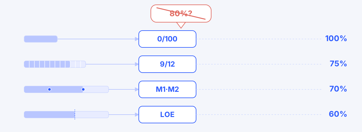 How to Measure Progress: 6 EVM Methods from the 0/100 Rule to Physical MeasurementProgress is the output of a measurement method, not a guess — the six EVM methods (fixed formula, weighted milestone, percent complete, physical measurement, apportioned effort, LOE) and how to pick one for each kind of work.